Buying Guide · Finishes & Materials
A lighting finish is the one decision in a room that touches everything else. It sits at eye level, it catches every lamp and every window, and it either agrees with your faucets, your cabinet pulls, your countertop and your floors — or quietly argues with them for years.
The good news: there is no single correct finish, and the rules are far looser than most showrooms suggest. What matters is understanding what each finish does to a room — how warm it reads, how much contrast it creates, how it behaves under a 2700K bulb versus daylight — and then choosing deliberately instead of defaulting.
This guide covers the four metal finishes you will be asked to choose between most often, the natural material finishes that define a fixture more than its metal ever will, how to mix finishes without the room looking accidental, and what each one asks of you in maintenance. Product examples throughout are pieces we actually stock, so you can see the principle rather than imagine it.

First Principles
Why the finish decides more than the shape
It sets the room's temperature
Warm finishes — brass, bronze, copper, aged gold — push a room toward comfort and age. Cool finishes — nickel, chrome, polished silver — push it toward clarity and precision. Black and bronze add weight; alabaster and paper remove it. Before you choose a metal, decide which direction the room needs.
It controls contrast
A black fixture on a white ceiling is a line drawing: graphic, deliberate, impossible to ignore. The same silhouette in champagne brass almost dissolves into a warm wall. Finish is how you decide whether a fixture is the subject of the room or part of its background.
It changes the quality of light
Finish is not only surface — it is reflector. Brass and copper interiors warm the light they bounce. Polished nickel and white interiors keep it neutral and bright. Alabaster, washi paper and opal glass turn a bulb into a soft glowing volume instead of a point source.
Quick Reference
The finish map
If you only read one part of this guide, read this table. Everything after it is detail.
| Finish | Reads as | Pairs naturally with | Strongest rooms | Watch out for |
|---|---|---|---|---|
| Polished Brass | Warm, luminous, a little glamorous | Walnut, cream plaster, marble with warm veining, deep green, velvet | Dining room, entry, bar, powder room | Reads loud in large doses — let one piece carry it |
| Brushed / Antique Brass | Warm but quiet, already lived-in | Oak, linen, limewash, travertine, unlacquered hardware | Kitchen, bedroom, hallway, open-plan living | Varies in tone between makers — compare in person |
| Champagne Gold | Soft, pale, barely-there warmth | Greige walls, white oak, light quartz, soft pinks | Bedroom, nursery, modern transitional spaces | Can disappear against pale walls — use shape for presence |
| Bronze / Copper | Deep, grounded, quietly historic | Dark wood, leather, terracotta, slate, exposed beams | Study, staircase, covered porch, farmhouse kitchen | Needs enough light in the room or it goes muddy |
| Polished Nickel | Bright, cool, formal, slightly liquid | Carrara and other cool marbles, glass, chrome fittings, navy | Bathroom, kitchen, formal dining, hotel-style bedroom | Shows fingerprints and water spots |
| Brushed Nickel / Satin Silver | Neutral, calm, almost invisible | Nearly everything — the safest cool neutral | Family bathrooms, hallways, kids' rooms, rentals | Safe can become forgettable — choose a stronger silhouette |
| Matte Black / Blackened | Graphic, architectural, modern | White walls, oak, concrete, black window frames, bold art | Kitchen, loft living, staircase, outdoor, office | Shows dust; too many pieces turns a room spotty |
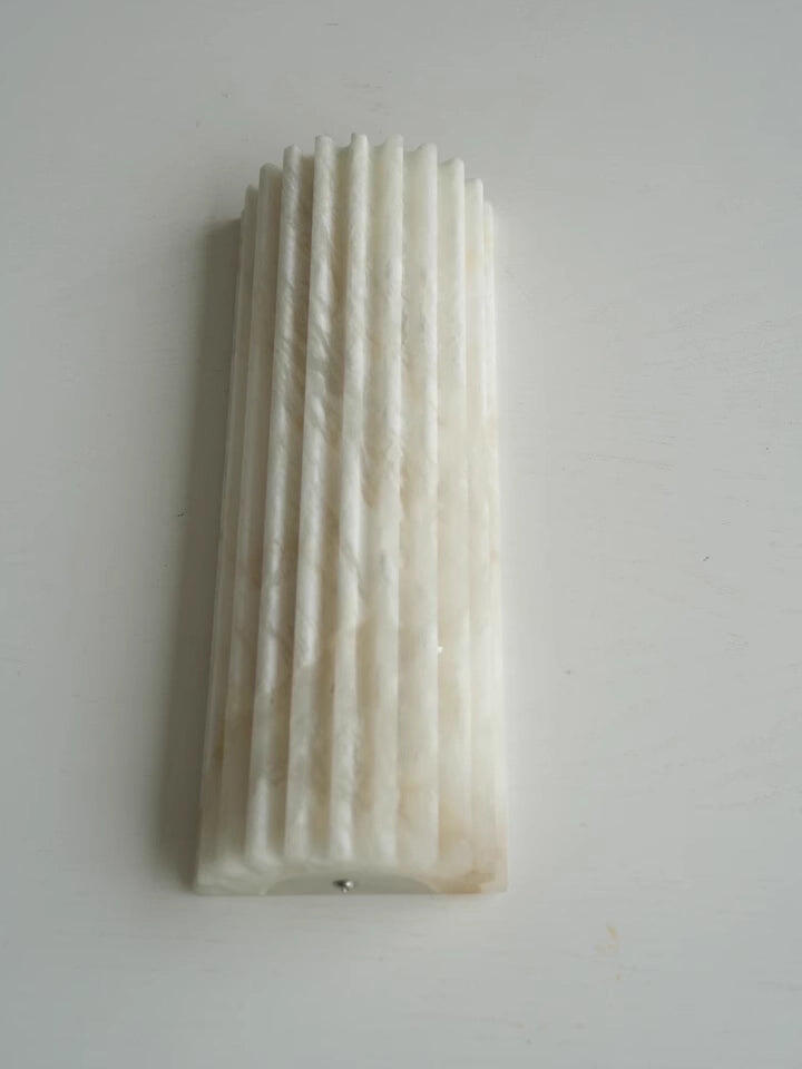
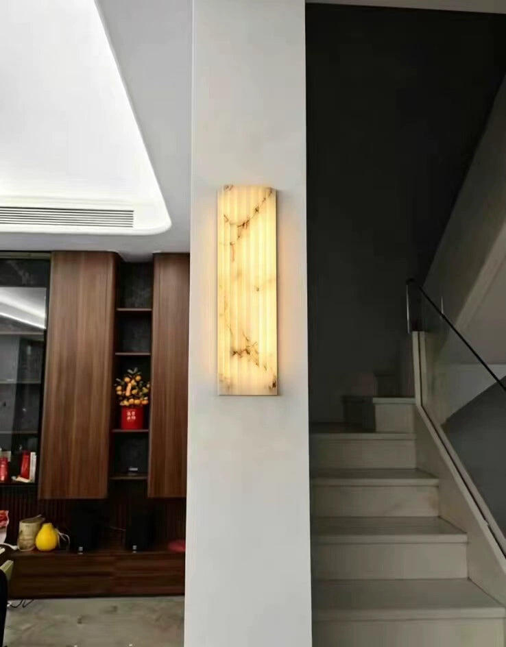
| Alabaster / Marble | Soft, substantial, expensive-quiet | Plaster, bouclé, warm woods, brass or black metalwork | Entry, primary bedroom, dining, formal living | Natural veining varies piece to piece by design |
| Hand-Blown Glass | Luminous, artisanal, jewel-like | Polished metals, lacquer, mirror, rich wall colour | Dining, stairwell, bar, powder room | Pick the metal frame finish first, glass colour second |
| Washi Paper | Weightless, diffuse, Japandi-calm | Pale wood, tatami tones, linen, wabi-sabi interiors | Bedroom, reading corner, meditation or tea room | Not for steamy bathrooms or exposed outdoor use |
| Solid Wood | Organic, warm, tactile | Rattan, stone, matte black accents, earth-toned textiles | Dining, farmhouse kitchen, cabin-style living | Match undertone to your floor, not its exact species |

 Finish 01
Warm · Refined · Timeless
Brass and gold
Brass is the warmest finish that still reads as a metal rather than a material. It flatters skin, warms the light it reflects, and gives a room the sense of having been assembled over time rather than ordered at once. It is also the finish with the widest internal range, and the range is where most mistakes happen.
Polished brass is bright and reflective — a statement finish for one hero fixture. Brushed or satin brass keeps the warmth and drops the shine, which makes it the most forgiving everyday choice. Antique brass has been darkened in the recesses, so it already looks aged and sits comfortably in traditional rooms. Champagne gold is the palest of the family, closer to a warm neutral than to gold.
Choose brass when
- Your woods are warm — walnut, cherry, warm white oak
- Your stone has beige, cream or gold veining
- Walls are cream, plaster, limewash, deep green or deep blue
- The room gets little natural light and needs warming
- You want a fixture to feel collected rather than brand new
Pairs naturally with
- Walnut
- Cream plaster
- Warm marble
- Velvet
- Deep green
- Unlacquered hardware
- Rattan
Unlacquered brass is a living finish — it darkens and patinas with handling. Lacquered brass stays as bought. Neither is better; just decide which story you want before you buy.
 Aquitaine Long Chandelier Polished Brass / Blackened / Silver A linear brass fixture is the easiest way to introduce warm metal over a dining table without committing the whole room to gold. View fixture
  Lotus Leaf Glass Chandelier Gold + Clear / Gold + Pink Gold framing with glass petals — the warmth stays in the structure while the light stays clean and bright. View fixture
  Lampatron Marble Wall Lamp Gold & White Brass against pale stone is the classic warm-plus-quiet pairing, and a sconce is the lowest-risk place to test it. View fixture

 Finish 02
Deep · Grounded · Sophisticated
Bronze and copper
Bronze is brass with the brightness taken out. It carries the same warmth but absorbs light instead of throwing it back, which is why bronze fixtures feel heavier and older than their silhouette suggests. Copper sits beside it — pinker, livelier, and the most reactive of the warm metals, developing a genuine patina over years.
Both are anchoring finishes. In a room full of pale surfaces, a bronze or copper fixture gives the eye somewhere to rest. In a room that is already dark, they merge into the background — sometimes exactly what you want above a staircase, rarely what you want over a dining table.
Choose bronze or copper when
- Floors or beams are dark-stained wood
- There is leather, terracotta, slate or aged stone in the room
- You want weight and age without the shine of brass
- The architecture is traditional, farmhouse, Tudor or Spanish-influenced
- A covered porch or entry needs a finish that forgives weathering
Pairs naturally with
- Dark walnut
- Leather
- Terracotta
- Slate
- Exposed beams
- Oil-rubbed hardware
- Jute
Copper and rose-gold tones read pink next to true brass. If you want both warm metals in one room, separate them by distance — one in the dining area, one in the adjoining hall — rather than side by side.
 Gooseneck Cone Wall Sconce Black / Copper The same traditional frame in two directions: copper for warmth and age, black for a crisper, more modern read. View fixture
  Atollo Table Lamp Copper / Gold / Black / White A geometric silhouette is the best place to test a copper finish — the shape carries the room, the metal just sets the temperature. View fixture
  Marble Disc Wall Sconce Brass Warm metal and cool stone in one small fixture — useful when a hallway needs warmth but not another gold statement. View fixture

 Finish 03
Clean · Polished · Elegant
Nickel, chrome and silver
Cool metals do something no warm metal can: they keep light neutral. Nothing is tinted, nothing is warmed, and the fixture reads as precise rather than cosy. That makes them the natural choice wherever accuracy matters — mirrors, vanities, kitchens — and wherever the room's palette is already cool.
Polished nickel has a faint warm grey in it, which keeps it from looking clinical; it is the most luxurious of the cool finishes and the most formal. Chrome is colder and bluer, sharper under daylight. Brushed nickel and satin silver trade reflection for calm and are the most forgiving finishes in the entire guide — they show almost no fingerprints and quarrel with almost nothing.
Choose a cool metal when
- Your marble or quartz has grey or blue-grey veining
- Plumbing fittings are already chrome or nickel
- Walls are cool white, grey, navy or soft blue
- The room is glassy, mirrored or very bright
- You want a formal, hotel-calibre feel rather than a collected one
Pairs naturally with
- Carrara marble
- Clear glass
- Mirror
- Navy
- Grey oak
- Crystal
- Lacquer
In a bathroom, match the fixture to the faucet family rather than to the cabinet colour. Cool metals near a mirror are the one place where matching really does pay off.
 Eclipse table lamp Polished Nickel + Blue / Polished Gold + Blue The nickel version keeps the blue glass cool and crisp; the gold version turns the same piece warm and antique. View fixture
  Pipistrello Table Lamp Silver / Polished Brass / Blackened A compact fixture offered in all three metal temperatures — the simplest way to compare cool, warm and black on one silhouette. View fixture
  Guzzini Table Lamp Grey When nickel feels too shiny, a soft grey metal gives the same cool neutrality with none of the reflection. View fixture

 Finish 04
Architectural · Graphic · Modern
Matte black and blackened metal
Black is the only finish that works as a drawing tool. It outlines a fixture against the ceiling, defines the structure of a room, and reads intentional in a way that no mid-tone metal can. It is also the finish most likely to be overused, because it is the easiest to specify.
Matte black is flat and absorbent — the most modern read, and the most sensitive to dust. Blackened or gunmetal finishes keep some depth and sheen in the surface, so the fixture still catches light; they sit more comfortably in transitional rooms than true matte. Both work best as deliberate punctuation: a line of black pendants over an island, black sconces flanking a mirror, a black frame around something soft.
Choose black when
- Walls are white or very pale and the room needs structure
- Window frames, railings or door hardware are already black
- The look is modern, industrial, minimal or Japandi
- You want a fixture read as architecture, not jewellery
- Outdoors, where a dark finish hides weather and dirt best
Pairs naturally with
- White walls
- White oak
- Concrete
- Black window frames
- Linen
- Bold art
- Brass accents
A reliable limit: no more than three black moments in one sightline. Beyond that the room starts to look spotted rather than composed.
 Wright‑inspired Round Chandelier Black / White / Gold / Green / Grey Five finishes on one adjustable arm, so a pair can be matched to black hardware, warm metal or the wall colour itself. View fixture
  Mobile Chandelier Black / Gold Thin black arms behave like line work across a ceiling — graphic from every angle without adding visual weight. View fixture
  Traditional Mid-century 2097 Chandelier Black / Gold Black metal against pale stone is the cleanest high-contrast pairing in the whole finish palette. View fixture
Side By Side
One fixture, three finishes
The clearest way to understand finish is to hold the silhouette constant and change only the metal. Our Raindrop Linear Chandelier is offered in all three temperatures — warm, cool and black — above the same table.


Beyond Metal
The material finishes that matter more than the metal
On most of our fixtures the metal is the frame and the material is the subject. Stone, glass, paper and wood do not just carry a colour — they change how the light arrives in the room.

Alabaster & marble
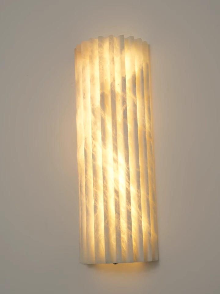
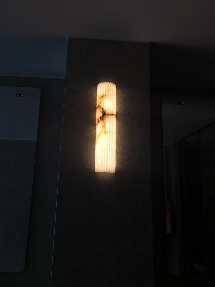
Stone reads as weight and quiet money. Alabaster is translucent, so it glows from within rather than reflecting; marble is opaque and behaves like architecture. Both pair happily with brass or black metal, and because the veining is natural, no two pieces are identical — that variation is the point, not a defect.

Hand-blown glass
Glass is the finish that changes most with the bulb behind it. Clear glass keeps the fixture architectural; opal and frosted glass turn it into a soft volume; coloured glass throws tinted light onto nearby walls. With glass fixtures, choose the metal frame finish first — it is what must agree with your hardware — then choose the glass colour for mood.

Washi paper
Paper is the lightest finish in every sense — visually weightless, and it diffuses so completely that the fixture becomes a glowing shape rather than a source. It belongs in rooms built on calm: bedrooms, reading corners, Japandi and wabi-sabi interiors. Keep it out of steamy bathrooms and anywhere exposed to weather.
 Solid wood
Wood brings warmth without shine, which makes it the easiest organic finish to live with. The rule is undertone, not species: a warm honey fixture over cool grey-washed floors will fight, while the same fixture over white oak will look inevitable. Wood also takes black metal accents better than any metal finish does.
The Question Everyone Asks
Does lighting have to match the hardware?
No. Lighting is the one category that is allowed to differ — and often should.
Hardware wants consistency
Cabinet pulls, hinges, faucets and door levers are touched, repeated and seen in sequence. Keeping them in one family makes a room feel resolved. This is where matching genuinely pays off.
Lighting wants intention
A fixture is a single object at eye level, closer to furniture than to fittings. It can introduce a second metal the way a brass-footed chair or a gilded mirror would — as a deliberate accent rather than an inconsistency.
Aim for harmony, not identity
What the eye rejects is not a different metal; it is a different undertone. Warm brass next to warm bronze reads collected. Cool chrome next to warm champagne reads unresolved. Group by temperature first.
Mirrors are the exception
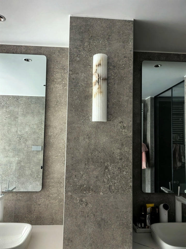
Anywhere a fixture sits beside a mirror — vanity sconces, powder rooms — keep it in the same family as the faucet. Both are seen in the same reflection at the same moment, and the mismatch is unavoidable there.
Method
How to mix metal finishes without it looking accidental
Mixed metals read as designed when there is a clear hierarchy. Start with proportion.
Do this
- Pick one dominant metal and let it cover most of the fittings in the room
- Keep the total to two metals, three at the absolute most
- Repeat every metal at least twice, so nothing looks like a leftover
- Pair one warm with one cool when you want contrast — brass with black, nickel with brass
- Use a mixed-finish piece — brass with marble, nickel with blue glass — to bridge two metals legitimately
- Separate metals by plane: warm overhead, cool at the counter
Not this
- Two near-identical warm metals side by side — champagne beside polished brass reads as a mistake, not a mix
- Three metals in equal measure, which removes the hierarchy entirely
- A single orphan finish appearing once in a whole room
- Mixing within one fixture group — a row of pendants over an island should match each other
- Choosing a finish from a screen; request a sample or compare in daylight when you can
- Letting the finish decide before the silhouette does
Room By Room
Where each finish performs best
| Room | Safest choice | Designer choice | Why it works |
|---|---|---|---|
| Kitchen | Matte black or brushed nickel | Brushed brass over the island | Island pendants are the one place a second metal is expected. Black hides cooking grime best. |
| Dining room | Brushed brass | Alabaster or hand-blown glass | Warm light flatters food and faces; a translucent material keeps sightlines across the table open. |
| Entry / foyer | Polished brass | Alabaster cluster chandelier | The first fixture a guest sees sets the home's temperature. Scale matters more than finish here. |
| Primary bedroom | Champagne gold or washi paper | Washi paper pendants either side of the bed | Diffuse, low-contrast finishes keep the room restful and read well in lamp-light. |
| Bathroom | Polished or brushed nickel | Marble-and-brass sconces | Cool metals keep mirror light accurate; match the faucet family above all. |
| Living room | Mixed — brass overhead, black accents | Glass or stone statement chandelier | The largest room tolerates the most mixing, as long as each metal repeats. |
| Study / den | Bronze or blackened metal | Solid wood pendant | Darker, heavier finishes make a small working room feel considered and quiet. |
| Staircase | Matte black | Long linear or cascading glass | Black disappears into shadow and keeps attention on the drop; height carries the drama. |
| Outdoor / porch | Matte black | Bronze | Dark finishes hide weathering and pollen; avoid paper and unsealed wood entirely. |

 Light & Form
Two Things People Forget
Bulb colour and fixture shape
Bulb temperature can undo a finish. Warm metals need warm light. Brass, bronze and copper come alive at 2700K and go grey-green under anything above 4000K. Cool metals hold up across the range, which is why nickel suits bathrooms where brighter light is useful. Alabaster, opal glass and washi paper look best at 2700K–3000K, where they glow rather than glare. Whatever you choose, keep every bulb in one room at the same temperature — mismatched bulbs ruin more rooms than mismatched metals ever do.
Shape decides how much finish you can carry. A slim, open silhouette in polished brass reads as a fine line and almost never overwhelms. The same brass on a broad, solid form becomes a large gold object. If you love a rich finish but fear too much of it, choose it on something linear, wiry or tube-based; if you want a bold form, let it be quiet in matte black, alabaster or paper.
Our fixtures ship without bulbs, so you are free to pick the exact colour temperature your finish and your room need.
Living With It
What each finish asks of you
| Finish | Everyday upkeep | Ages by | Best for |
|---|---|---|---|
| Lacquered brass | Dry microfibre; no polish or acid | Staying as bought | Anyone who wants the colour to stay put |
| Unlacquered brass | Dry cloth, or polish only if you want it bright | Darkening and patinating where touched | Collected, evolving interiors |
| Bronze / copper | Dry dusting only | Deepening in tone over years | Traditional rooms, covered outdoor spaces |
| Polished nickel & chrome | Microfibre; wipe water spots promptly | Staying bright, showing prints | Formal baths and kitchens |
| Brushed nickel | Almost none | Barely changing at all | Busy family spaces |
| Matte black | Regular light dusting | Holding colour; showing dust | Modern and outdoor settings |
| Alabaster & marble | Soft dry brush; no household cleaners | Not changing — stone is stable | Statement fixtures meant to last |
| Hand-blown glass | Soft cloth, piece by piece | Not changing | Dining rooms and stairwells |
| Washi paper | Feather duster; keep dry | Mellowing slightly in tone | Dry, low-traffic rooms |
| Solid wood | Dry cloth; keep off direct heat | Deepening in colour with light | Warm organic interiors |
Common Questions
Finish questions, answered
Is brass still current, or is it dated?
What is the safest finish if I am unsure?
Can I mix brass and black in the same room?
How do I choose a finish against marble or quartz?
Will the finish look the same as it does on screen?
Can I order a fixture in a finish that is not listed?
Does every fixture in the house need to share one finish?
Which finishes work outdoors?
Shop The Guide
Explore lighting by finish and material
In Short
Choose the temperature, then the finish
Decide whether the room needs warming or clarifying, pick the finish family that does it, keep one metal dominant, and let the material — stone, glass, paper, wood — do the work the metal cannot. Everything else is preference, and preference is allowed.
Still deciding between two finishes on the same fixture? Send us the piece and a photo of the room; we make our own lighting and can advise on — or customise — the finish before anything ships.
Ask our design team